

Pantone 2026 Color of the Year: Cloud Dancer
Cloud Dancer (PANTONE 11-4201) is the 2026 Color of the Year. Pantone shared this news with the world. The shade is a soft off-white. It has both warm and cool tones. It is not a bright or pure white. It feels calm, light, and natural. Many people call it “billowy,” “balanced,” and “soft.”
This is the first time Pantone has picked a white or off-white shade since 1999.
Why Pantone Picked Cloud Dancer
Pantone says life feels loud today. We face too much information. We feel pressure from digital life. Things change fast. Many people feel tired and stressed.
Pantone chose Cloud Dancer to bring a sense of peace. The color feels like a fresh start. It is quiet and gentle. Instead of a bold color, Pantone chose a shade that works like a clean page. It gives space for ideas, creativity, and rest.
Pantone calls it a “lofty white.” They say it helps the mind slow down. It supports simple living and quiet moments.

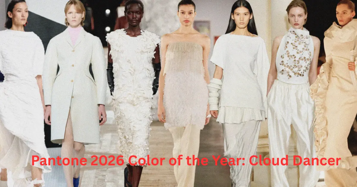
How Cloud Dancer Influences Design, Fashion, and Daily Life
Cloud Dancer is soft and easy to use. It fits many styles and spaces. Here is how it may appear in different fields:
1. Home and Interior Design
Cloud Dancer works well on walls, furniture, and decor. It makes a room feel open and calm. The shade lets natural materials shine. Wood, stone, and linen look warm next to it.
It also works as a clean base for bold items or bright colors. In simple or “quiet luxury” homes, the color creates a soft and timeless mood.
2. Fashion and Clothing
In clothing, Cloud Dancer looks light and elegant. It fits flowing dresses, clean shirts, and minimal outfits. As a neutral color, it pairs with almost any shade. You can keep the look simple or use bright accessories for contrast.
3. Graphic Design, Branding, and Products
In design, Cloud Dancer works like white space. It gives room for text, images, and shapes. It does not shout for attention. It makes designs look clean and clear. As a background, it helps other elements stand out.
Strengths of Cloud Dancer
Calm and Versatile
The color fits many uses. It is safe and easy to work with.
Timeless
It does not follow short-term trends. It can look fresh for many years.
Flexible
It works with many colors, textures, and materials. It acts like a blank canvas.
Helps Mental Ease
The soft shade offers a quiet feeling. It gives a break from busy life.

Possible Drawbacks
May Feel Too Quiet
Some people may think it looks plain or simple.
Less Bold
It does not create strong contrast or high impact. It is not ideal for loud visual identity.
Depends on Pairing
Its beauty grows when paired with other colors or materials. Alone, it can feel soft but simple.
What This Color Choice Says About Our Time
Choosing an off-white in 2026 shows a need for calm. Many people want less noise and more clarity. Cloud Dancer reflects a wish for slow moments and clean spaces. The world is full of digital stress, so a neutral color feels like relief.
Pantone’s choice supports the idea of “less is more.” It values space, quiet, and gentle beauty.
How You Can Use Cloud Dancer
• Paint a room or furniture to create a soft and light space.
• Mix it with wood, clay, or natural fabrics for warmth.
• Wear it for a clean and flexible look. Add bold items if you want contrast.
• Use it as a background in posters, websites, or packaging.
• Choose it when a space feels crowded. The shade brings balance and rest.
